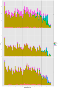
After a fairly heavy set-up, this is a more relaxed look at some of the visualisations possible when you have benchmarked your data. This, if you like, is the pay-off for the hassle of aligning your data with the standards. Our first one is nicknamed “the factory gate”, and treats the application system as if it were a manufacturing plant.
what is in our system ?
To begin at the beginning, our first visualisation is a nice simple question – “what is going on ?”. I described this picture in terms of the planning department being like a factory. Our traditional measure (the much-beloved national indicator NI157) only recognises planning applications when they are determined (or, using our metaphor, shipped out as completed product from the rear of the factory). Thus, it cannot help you understand how busy you are currently, are likely to be in the future and how well applications are moving through the system.
This, then, helps you as the proprietor of the planning application factory understand what raw materials are coming into your factory, and what status they are at currently.
planning application process
Our first job is to standardise the process. Our standards describe a small set of statuses, and in order it goes:-
- New – it drops onto the mat. Enough time to register it, but not to see if it’s valid, get history, make up file, check fee etc. This should be a temporary status.
- Valid – it’s ready to work on, because it’s all there and ready to use (or …). This should be a temporary status.
- Invalid – it’s not yet ready to work on, because it’s missing something. This should be a temporary status.
- Wdrawn – some applications get withdrawn, for a number of reasons. Permanent status.
- Appeal – some go to appeal, either before determination or after. Permanent status.
- Determined – it’s finished. Permanent status.
(obvious to planners, but for the rest of us the application does not have to go through each status. Most applications go “new” -> “valid” -> “determined”)
qplot(month, data=applist, xlab="months starting Jan 2005", ylab="work", geom="histogram", binwidth=1, facets= Place ~ .,fill=rstatus) +scale_x_continuous(breaks = quarters) +geom_vline(xintercept = dec)
I set out in a previous post most of the set-up to prepare the data. The picture is generated by a single line of code. To break it down a little, it says:-
qplot( # this is the wrapper function
month # we want to group applications by the month in which they were received (as opposed to, for example, their current status)
data = applist # the data comes from the dataframe ‘applist’
xlab = ” .. ” # the label for the x axis
geom = “histogram” # we want to use a histogram (what you might call a bar chart)
binwidth = 1 # histograms can be used to plot continuous distributions, or group discrete ones. You want this graph to plot quarters ? then binwidth = 3
facets = Place ~ . # facets are the name for plotting aspects separately, so you can compare. This plot uses only one axes of faceting. The grammar is “facets = thing1 ~ thing2”, with the wiggly thing (tilde) used as a separator and a dot (.) used as a placeholder if you don’t want to use both axes. Lovely trick – we’ll be using a lot of this in our benchmarking process.
fill = rstatus # this is what turns it from a count of applications received per month to what in excel is called a “stacked bar”. The fill colour of our histogram is dependent on the status of each application.
) # this ends the qplot function
+scale_x_continuous(breaks = quarters) # this provides the nice grey quarters, to help our eyes get a feel for each part of the year (note that ‘quarters’ is a variable that we’ve defined as a set of numbers separated by 3)
+geom_vline(xintercept = dec) # and this provides the vertical black lines to divide out the years. Again, ‘dec’ is a variable that runs 12,24 etc.
So, in return for a little bit of thinking about how to set out the command you get beautiful default colours, aligned axes and pleasing labels. Not to mention the ability to export it straight into any number of formats. Plus – the killer argument for me – you get a script you can run against data that complies with the standard format that does all the processing and generates all the graphs for you. That is just lovely.
why bother ?
Ah yes, the “so what ?” question. This plot allows you to see …
- How much work is coming into your factory. The overall height isn’t perfect (the genuine amount of work a given number of applications represents is dictated in part by the application mix) but it’s a start. The amount of work coming in now will lead to peaks / troughs in work all the way through the system. Go on, it’s more variable than you thought, isn’t it ? But yes, it has got a bit quiet lately …
- How many applications get withdrawn. This is something worth worrying about – withdrawn apps include those that should never have been made in the first place (because permission is not required) or those that are hopeless. There are things you can do to reduce both these numbers – making life easier for your applicants and staff.
- How long applications stay in the “new” box. A good validation department should convert “new” applications into “valid” applications that planners can work on. If you study one of the dummy places, you can see that there are new applications that are actually months old.
Alongside these generally good things is the fact that you can re-run the report and see (immediately) whether processes are improving. A good start to our visualisations.

